Again I returned to my graphics tablet to create more images. I used the graphics tablet because I felt that my smaller and more populated images may be damaged by stitching into them. Having said this though, I am really happy that I used my graphics tablet again as I feel that by mixing traditional hand stitching with digital graphics I created a multi layered final piece. Also by using Photoshop I was able to put a lot more detail into the graphics than what I could achieve by hand sewing. These are the resulting images:
Laura Armstrong Art Unit four
Monday, 29 April 2013
Tuesday, 23 April 2013
Final Piece development- Embroidery Thread
In my test pieces I used my graphics tablet to replicate Anzeri's work, incorporate my previous work on Savchenko and to avoid sewing machines. However I felt that I could hand stitch into some of my edited images to decipher whether or not it looked good. I used neon embroidery threads to contrast with my black negative photographs and in my older images I used more muted threads so I wouldn’t overshadow the photo. After completing these pieces and seeing the results I will definitely be including these in my final piece.
(Image quality is down as the images are scans)
Saturday, 20 April 2013
Final Piece development- Black & White images
Here are the final black and white edits created by myself in photoshop, however I will only choose a certain few to edit further.
Sunday, 14 April 2013
Final Piece development - Black & White Photography edits
When researching Maurizio Anzeri I discovered that he uses a mixture of old and modern work in his images. Linking back to my Igor Savchenko responses, in which I created my favourite work, I decided that I could create a mixture of modern and old photographs. As photographs weren’t as common in the early 20th century, people would treat getting their photograph taken as an occasion. So in my taken photographs I wanted to recreate the poses and gestures in my grandmothers old photographs but I then I also wanted to create less restricted photographs where the subjects mimicked the strange expressive artwork in a Dazed and Confused editorial featuring images from Photographer Richard Burbidge in June 2011. After thinking this over I decided it would be better to offset the formal poses of the old fashioned photographs with modern expressive photography. My total of around 8 images of varying sizes will be displayed in black picture frames.
Anzeri's Modern Work (Dazed and Confused)
Although I wanted to create a contrast between the old and new photographs I still desired a sense of continuity, therefore I edited my modern photographs and turned them black and white using Photoshop. When adjusting the colour levels I discovered I would make the skin pitch black by lowering the yellow pigment bar, I really liked the negative effect it created so I edited more of the photographs to varying degrees.
 |
| Black and white Levels |
Friday, 5 April 2013
Chosen Final piece artist- Maurizio Anzeri with Graphics Tablet test piece
Although Anzeri's work is stitched into using sewing machines, I felt I could rework his chosen media and create graphics tablet drawings that mimicked the movement and mark making technique of embroidery thread as I was reluctant to use sewing machines as I have had troubles with them in the past. However I really liked the out come of my test pieces, all of which feature my own images- unlike Anzeri who uses old vintage images or photographers images. I feel I have worked in his almost tribal feel and influences and I will defiantly be using him as inspiration for my final piece.
Maurizio Anzeri's work (Above)
My Test Pieces with Graphics Tablet (Below)
Tuesday, 2 April 2013
Final Piece Artists- Cristina Troufra & Olga Feldman
In my generation of ideas I was torn between 3 vastly different ideas.
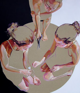
Although I hadn't created any paintings as a response to my three artists, I had developed my drawing style through my life drawings and various initial observational sketches. I had come across Cristina Troufra's work on pinterest on a paintings and illustrations board (http://pinterest.com/sharvey/illustrations-paintings/), her depictions of various body poses and unfinished look interested so I created a small test piece using brown paper and acrylic paints. Although I liked the image I had painted (primary source photograph as reference) I feel that I am not a very accomplished painter and would not have been able to carry off a large scale painting.
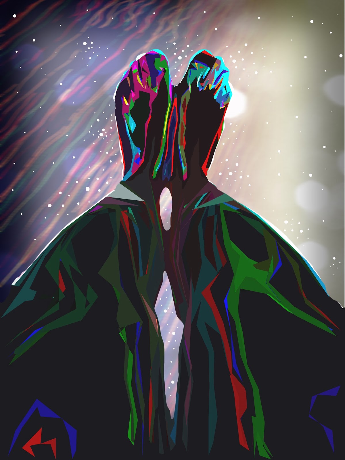
On the other hand my test piece to Olga Feldman helped me tread on familiar ground. Again I came across Feldman on pinterest and quickly saw parallels to my own project, despite depicting body parts in her work she uses untraditional medias such as graphics. As I had used my graphics tablet in many different responses, I used it again with the aid of photoshop to create a test piece of feet. As Feldman's work has a cosmic feel I tried to replicate it. Although I really like the resulting image, the end photograph has over 100 layers- which made the image file very large and therefore photoshop or other media's displaying in image in a PDF format were prone to crashing. I feel that it would have been a large risk to take if I where to create more of these images (which was what I was planning to do).


Although I hadn't created any paintings as a response to my three artists, I had developed my drawing style through my life drawings and various initial observational sketches. I had come across Cristina Troufra's work on pinterest on a paintings and illustrations board (http://pinterest.com/sharvey/illustrations-paintings/), her depictions of various body poses and unfinished look interested so I created a small test piece using brown paper and acrylic paints. Although I liked the image I had painted (primary source photograph as reference) I feel that I am not a very accomplished painter and would not have been able to carry off a large scale painting.
Cristina Troufra's work (above)
On the other hand my test piece to Olga Feldman helped me tread on familiar ground. Again I came across Feldman on pinterest and quickly saw parallels to my own project, despite depicting body parts in her work she uses untraditional medias such as graphics. As I had used my graphics tablet in many different responses, I used it again with the aid of photoshop to create a test piece of feet. As Feldman's work has a cosmic feel I tried to replicate it. Although I really like the resulting image, the end photograph has over 100 layers- which made the image file very large and therefore photoshop or other media's displaying in image in a PDF format were prone to crashing. I feel that it would have been a large risk to take if I where to create more of these images (which was what I was planning to do).
Olga Feldman's work (Above)
My Response
Saturday, 9 March 2013
Rudolf Bonvie: Photography and Stop Motion Response
This response has become my favourite due to its simplicity and story telling. I took inspiration from Bonvie's 1973 work Dialog and created 42 photographs of my parents hands gradually taking off their wedding rings. The end result is both saddening and beautiful. As the images looked like a stop motion film I decided to place them together in a video, my first idea was for a GIF but unfortunately the amount of pictures I had overloaded the GIF generator.
| Rudolf Bonvie's Dialog |
The stop motion film
Subscribe to:
Comments (Atom)


